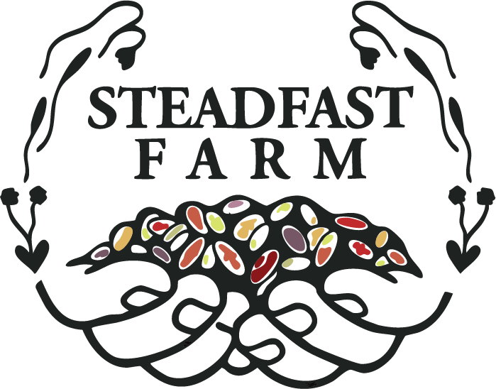
Steadfast Farm came to me looking for a refreshed logo that honored the spirit of their original mark while giving it an intentional refresh. The client specifically asked to replace the rice imagery with a pile of beans, one of their core crops, and to add a subtle floral, vining element. The updated logo keeps the familiarity and character of the original but introduces a more grounded visual identity that reflects the farm’s values: care, diversity, tenderness and bountifulness


Original Logo:
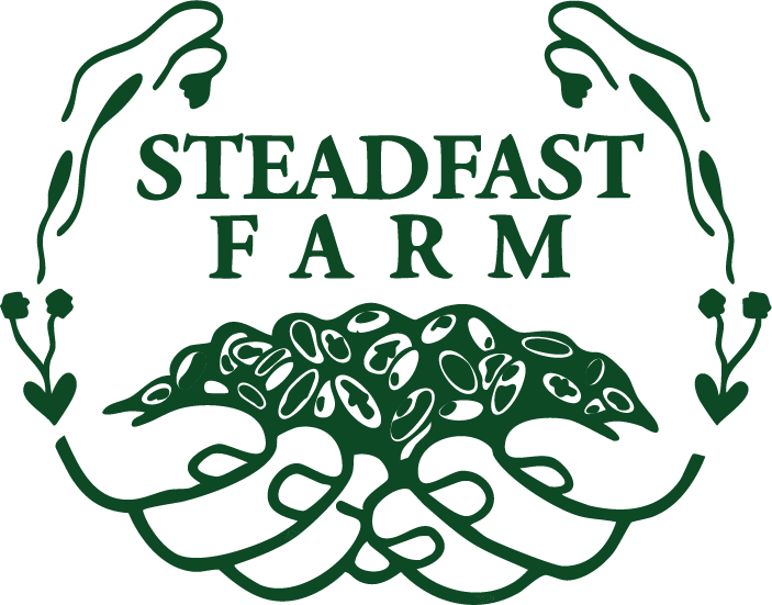
New, refreshed logo:
